Difference between revisions of "User talk:ElaineSpain-76"
| Line 57: | Line 57: | ||
:) | :) | ||
| + | |||
| + | ---- | ||
| + | |||
| + | |||
| + | |||
| + | |||
Revision as of 10:44, 18 June 2008
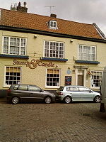
| The Stump and candle was previously known as ‘Martha’s Vineyard’ and ‘Rum Puncheon’. There is a blue plaque, which indicates the birthplace of John Foxe (1517-1578) author of The Book of Martyrs. | your text oxxxxxxxxxxxxxxxxxxxxxxxxxxxxxxxx xxxxxxxxxxxxxxxxxx xxxxxxxxxxxxxxxxxx | ||
| The Stump and candle was previously known as ‘Martha’s Vineyard’ and ‘Rum Puncheon’. There is a blue plaque, which indicates the birthplace of John Foxe (1517-1578) author of The Book of Martyrs. | your text oxxxxxxxxxxxxxxxxxxxxxxxxxxxxxxxx xxxxxxxxxxxxxxxxxx xxxxxxxxxxxxxxxxxx |
| The Stump and candle was previously known as ‘Martha’s Vineyard’ and ‘Rum Puncheon’. There is a blue plaque, which indicates the birthplace of John Foxe (1517-1578) author of The Book of Martyrs. | |
| your text oxxxxxxxxxxxxxxxxxxxxxxxxxxxxxxxx xxxxxxxxxxxxxxxxxx xxxxxxxxxxxxxxxxxx | |
| The Stump and candle was previously known as ‘Martha’s Vineyard’ and ‘Rum Puncheon’. There is a blue plaque, which indicates the birthplace of John Foxe (1517-1578) author of The Book of Martyrs. | |
| your text oxxxxxxxxxxxxxxxxxxxxxxxxxxxxxxxx xxxxxxxxxxxxxxxxxx xxxxxxxxxxxxxxxxxx |
Caroline - if you can think of a better way of doing it then please say!
I was trying to get them all left aligned under each other - obviously they will be different pictures!
A table will be the best bet Working with Tables otherwise you have to put load of spaces in and that will vary depending on the amount of text!!
I have used 150px for the top row and 200px for the second row so that you can see how it lines up. It depends how much text there is for each picture really, but four columns will work best ... or three with 100px ... it is matter of playing around to see how it looks best.
Alternatively, she could put all the text in as a caption but that might look a bit odd if there is a lot of text and still line them up in rows.
A thought - if the pictures are uploaded at 200 width then you can use frame instead of thumb and lose the tiny box in the frame.
- )
Sorry amended it slightly - forgot to add the words "destroyed 1918 on examples 2 and 3.
NO.1
Bloomsbury
Destroyed or demolished
- Christ Church, Bloomsbury Square.
Bow
No. 2
Bloomsbury
- Christ Church, Bloomsbury Square - destroyed 1918
Bow
No.3
Bloomsbury
- Christ Church, Bloomsbury Square - destroyed 1918
Bow


